How to Choose Zebra Shade Colors for Your South Florida Home
Learn how to choose zebra shade colors that complement your interior, manage bright Miami-Dade sunlight, support privacy, and fit each room.
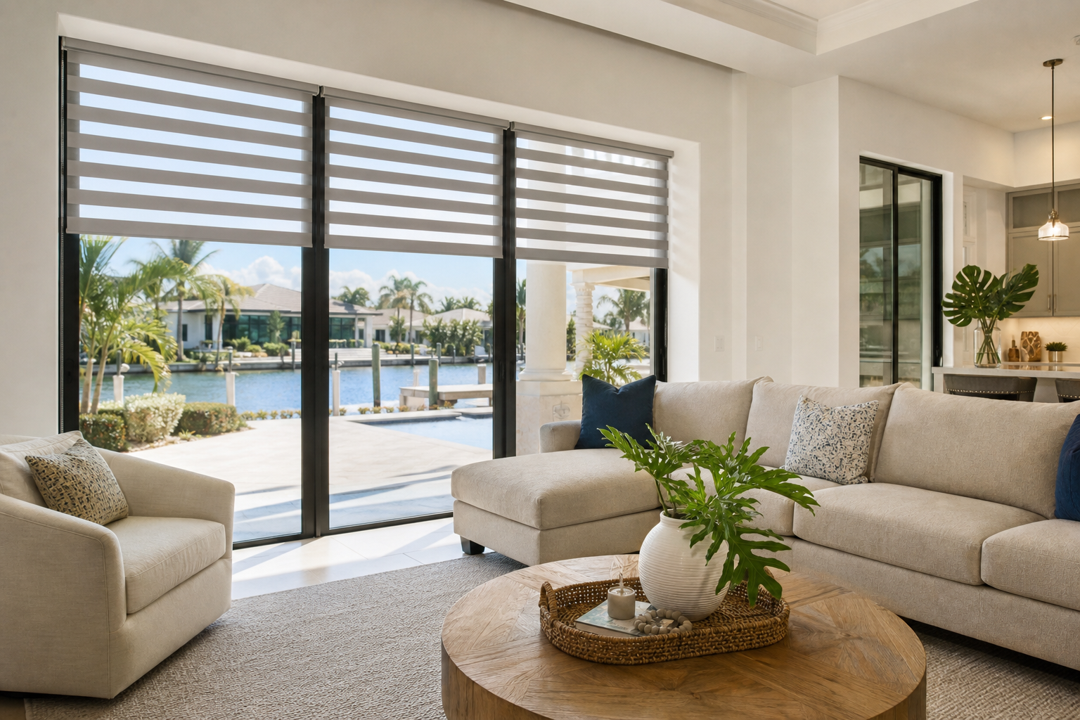
Choosing zebra shade colors is about more than matching a fabric swatch to your walls. The right color can influence how bright a room feels, how well your windows blend with the design, and how comfortable your home feels throughout the day. In South Florida, where strong sunlight, heat, and outdoor views are part of everyday living, color selection also plays a practical role.
Zebra shades combine alternating bands of sheer and more opaque fabric, allowing you to adjust light and privacy without completely losing the look of your windows. Whether you are furnishing a condo in Miami Beach, updating a family home in Kendall, or choosing treatments for large windows in Coral Gables, the best color depends on your room, window exposure, furnishings, and daily needs.
This guide explains how to choose zebra shade colors with confidence and how to avoid common mistakes before ordering custom window treatments.
Start With the Room’s Main Design Elements
Before comparing individual shades, identify the colors that are already permanent or difficult to change. These may include flooring, countertops, cabinetry, wall paint, tile, furniture, and large area rugs. Zebra shades do not need to match every item exactly. They should support the room’s overall palette and feel intentional alongside the features that are already there.
Use a simple color hierarchy
A helpful approach is to divide the room into three levels:
- Dominant colors: Large surfaces such as walls, floors, sofas, and cabinets.
- Secondary colors: Curtains, rugs, accent chairs, bedding, or other substantial furnishings.
- Accent colors: Decorative objects, artwork, pillows, and small accessories.
Zebra shades typically work best when they relate to a dominant or secondary color rather than competing with a small accent. For example, a warm ivory shade may complement cream walls and natural wood, while a soft gray shade may work well with cool tile, white furniture, or brushed metal details.
How Different Zebra Shade Colors Affect a Room
Color can change the visual balance of a room even when the shade fabric has the same operating style. Consider how each color family may behave in your space before focusing on a particular name or sample.
| Color family | Design effect | Often worth considering for |
|---|---|---|
| White and bright ivory | Creates a clean, airy appearance and keeps the window treatment visually light | Coastal interiors, bright living rooms, kitchens, and homes with white trim |
| Beige, sand, and taupe | Adds warmth and can soften rooms with wood, stone, or warm neutral finishes | Traditional, transitional, Mediterranean, and relaxed South Florida interiors |
| Light gray | Provides a balanced neutral appearance with a cooler, contemporary feel | Modern rooms, gray flooring, white walls, and spaces with blue or silver accents |
| Medium or charcoal gray | Creates stronger contrast and gives the window a more defined appearance | Contemporary spaces where darker trim or furnishings are already present |
| Natural and woven-inspired neutrals | Brings an organic, relaxed quality to the room | Homes with rattan, wood, linen-like textures, and indoor-outdoor design |
These are general design guidelines rather than strict rules. A darker shade can look elegant in a bright room, while a pale shade can work in a more dramatic space. The goal is to consider the complete room instead of judging the color by itself.
Consider How Much Sunlight the Room Receives
Window direction and daily exposure matter in Miami-Dade County. A room with strong afternoon sun may feel very different from one that receives softer morning light. The shade color you choose should look appealing in both natural daylight and evening interior lighting.
For bright, sun-filled rooms
Light neutrals can help maintain an open, relaxed appearance when the room already receives abundant daylight. They may also coordinate easily with the pale walls, light flooring, and coastal colors often found in South Florida homes.
If your priority is reducing glare, protecting furnishings from sunlight, or creating a darker environment, color alone will not determine performance. Ask about the available fabric and opacity options for the room. A color that looks attractive may not provide the level of light control you need for a television room, bedroom, or home office.
For rooms with less natural light
Warm whites, ivory, beige, and light taupe can help a dimmer room feel more welcoming. Very cool or dark colors may make the window area feel heavier, especially if the walls and furnishings are also dark.
However, a darker shade can be a deliberate design choice in a media room, study, or bedroom. The important question is whether you want the shades to blend into the background or become part of the room’s visual statement.
Choose Between Blending In and Creating Contrast
One of the most useful decisions is whether the zebra shades should disappear into the design or draw attention to the windows.
Choose a blending color when:
- You want the room to feel calm and uncluttered.
- The windows are large and you do not want a strong band of color across the wall.
- You plan to use artwork, furniture, or architectural details as the room’s focal point.
- You are selecting shades for several rooms and want a consistent, flexible look.
Choose contrast when:
- The room needs a stronger architectural or decorative element.
- The window frames, doors, cabinetry, or furniture already include a related darker tone.
- You want to emphasize a large window or create a more finished, tailored appearance.
- The rest of the room is simple and can support a bolder treatment.
For many homes, a shade color that is close to the wall color creates a seamless effect. A shade that is noticeably darker or warmer can frame the window and add definition. If you are unsure, compare samples next to the wall, trim, flooring, and furniture rather than viewing them in isolation.
Think About the View From Outside
Window treatments are seen from both sides. In neighborhoods with close homes, busy streets, balconies, or shared outdoor areas, the exterior appearance may be important. A coordinated neutral tone can help the windows look consistent from the outside, particularly when several windows are visible from the street or a neighboring property.
Privacy is also a key consideration for homes in Miami, Miami Beach, Key Biscayne, South Miami, and other areas where properties may be close together. The right zebra shade color can support the room’s design, but privacy depends primarily on the shade’s positioning, fabric arrangement, and coverage. Ask a window treatment professional how the selected style will work during the day and at night, when indoor lighting can change what is visible through a window.
Coordinate Zebra Shades Across Multiple Rooms
Using one color throughout the home is not your only option. A consistent neutral can create a unified appearance, while carefully selected variations can better suit each room. For example, you might use a light warm neutral in the main living areas, a cooler neutral in a modern office, and a deeper tone in a bedroom or media space.
When selecting different colors, keep at least one element consistent. This might be the general color family, the shade style, or the level of visual simplicity. Too many unrelated colors can make the home feel disconnected, especially in open-concept interiors where several windows are visible at once.
For homes with large windows, it is particularly helpful to consider the full wall rather than a single opening. A color that looks subtle on one small sample may have a much stronger presence when repeated across a wide window wall. Floridian Blinds also provides guidance for homeowners comparing options for larger openings in the Miami area; see this guide to zebra shades for large windows in Miami.
Do Not Choose Color Without Considering Fabric and Light Control
Color is only one part of the decision. Zebra shades can be selected for different combinations of light filtering, privacy, and visual softness, depending on the available options. Two shades with similar colors may look different when daylight passes through them, and a shade may appear more opaque when its bands are aligned for privacy.
When comparing samples, review them in the room where they will be installed. Look at them:
- In direct sunlight and indirect daylight.
- Against both light and dark walls, if the shade will be used in multiple rooms.
- With your existing flooring, counters, upholstery, and trim.
- During the evening with the interior lights on.
- With the shade bands in different positions.
This process can help reveal undertones that are easy to miss in a showroom or online image. A beige may lean pink, yellow, or gray. A white may feel crisp or warm. A gray may look blue or brown depending on the surrounding finishes and the amount of natural light.
South Florida Design Considerations
Homes in South Florida often combine bright interiors with strong connections to patios, gardens, balconies, pools, and outdoor entertaining areas. Zebra shades should support that lifestyle without making the interior feel disconnected from the exterior.
Warm neutrals and natural-looking tones can complement tropical landscaping, wood accents, stone, and outdoor textures. Clean whites and light grays may suit contemporary interiors with large glass areas and minimal furnishings. If your home has intense sun exposure, also discuss UV exposure, glare, and heat management with your window treatment professional. Shade color may influence the visual feel of the room, but the fabric and installation approach are important to the overall result.
For rooms that open directly to a patio or covered terrace, consider how the zebra shades will relate to patio screens or other outdoor shades. A coordinated palette can make the transition between indoor and outdoor living areas feel more intentional.
Common Mistakes to Avoid
Matching the shade to one small accessory
A shade selected to match a pillow, vase, or artwork may feel out of place if it does not relate to the larger room. Start with permanent finishes and substantial furnishings.
Choosing a color from a screen image
Phone and computer displays can alter color. Always evaluate a physical sample in the actual room whenever possible.
Ignoring undertones
Two neutral shades may both appear “beige” or “gray” but have very different undertones. Place samples beside your walls and flooring to see whether they coordinate.
Forgetting the evening view
A shade that looks subtle in daylight may appear more prominent when the room is illuminated at night. Consider how the window will look at the times you use the room most.
Focusing on color before function
Light control, privacy, glare reduction, and comfort should guide the fabric choice first. Once those needs are clear, narrow down the colors that complement your design.
Questions to Ask Before Selecting Your Zebra Shade Color
- Do I want the shades to blend with the walls or frame the windows?
- Which undertones appear in my flooring, cabinets, furniture, and trim?
- How does the room look in morning, afternoon, and evening light?
- Will the shades be visible from the street, patio, or neighboring property?
- Do I need better privacy, glare control, or light filtering in addition to a particular color?
- Will the selected color work across the entire window wall or open-concept area?
Frequently Asked Questions About Choosing Zebra Shade Colors
Are light-colored zebra shades better for bright rooms?
Light colors can make a bright room feel airy and visually open, but they do not automatically provide the right level of glare or heat control. Review fabric and light-control options along with color when selecting shades for sunny windows.
Should zebra shades match the walls?
They do not have to match exactly. A similar color creates a subtle, blended appearance, while a related but darker or warmer shade adds contrast. Compare samples with the wall, trim, flooring, and furniture before deciding.
What zebra shade colors work well with white walls?
Many colors can work with white walls, including ivory, beige, taupe, light gray, and natural neutrals. The best choice depends on whether the room has warm or cool finishes and whether you want the windows to blend in or stand out.
Can zebra shades help with privacy at night?
Zebra shades can be part of a privacy solution, but the result depends on the fabric, shade position, window location, and interior lighting. Discuss nighttime privacy needs before choosing a color or fabric.
Should every room have the same zebra shade color?
No. One consistent neutral can create continuity, but coordinated colors may be more appropriate for rooms with different furnishings, lighting, or design styles. Keep the palette related so the home still feels cohesive.
Choose Zebra Shade Colors With Confidence
The best zebra shade color balances appearance and everyday function. Consider the room’s permanent finishes, the direction and intensity of sunlight, your privacy needs, the view from outside, and how the shades will coordinate with the rest of your home. In South Florida, it is also wise to discuss glare, UV exposure, heat, and indoor-outdoor transitions as part of the selection process.
Floridian Blinds can help you compare zebra shade colors and window treatment options for your home or property. Contact us for a free consultation and measurement.